What is WPF?
WPF stands for Windows Presentation Foundation, which is a user interface framework used to construct desktop client apps. It’s amazing because it enables developers to simply build and create graphically richer UI-based applications. To name a few critical elements that might assist a WPF development company in speeding up its processes, include animation, styles, 2D, and 3D graphics, typography, data binding, and so on. Moreover, it uses XAML (Extensible Markup Language) to define views declaratively.
below given are various kinds of WPF controls:
- Grid layout
- Label
- Buttons
- Editors
- Lists
- Menus and toolbars
- Scroll Viewer
- Building Blocks
- ToolTip
- Thumb
- Border
- Popup
- Document Viewers
- Frame
- Ranges
- Containers
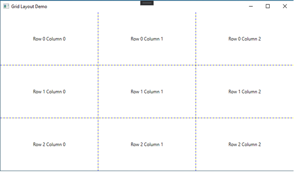
Grid Layout:
- In Grid, we can design our page or window in row and column format giving its value in button controls that’s why we can set button in selected row and column. It goes like this
Grid, Column Definition, Row Definition, Grid Lines.
Example of Grid Layout:
Here we describe the example of a grid that shows how a grid works. And how can we set grid rows and columns in our window.
<Window x:Class = “GridLayoutDemo.MainWindow”
Xmlns = “http://schemas.microsoft.com/winfx/2006/xaml/presentation”
xmlns:x = “http://schemas.microsoft.com/winfx/2006/xaml”
xmlns:d = “http://schemas.microsoft.com/expression/blend/2008”
xmlns:mc = “http://schemas.openxmlformats.org/markup-compatibility/2006”
xmlns:local = “clr-namespace:GridLayoutDemo”
machinable = “d”
Title = “Grid Layout Demo” Height = “450” Width = “800”>
<Grid ShowGridLines = “True”>
<Grid.RowDefinitions>
<RowDefinition Height = “*” />
<RowDefinition Height = “*” />
<RowDefinition Height = “*” />
</Grid.RowDefinitions>
<Grid.ColumnDefinitions>
<ColumnDefinition Width = “*” />
<ColumnDefinition Width = “*” />
<ColumnDefinition Width = “*” />
</Grid.ColumnDefinitions>
<TextBlock Text = “Row 0 Column 0” Grid.Row = “0” Grid.Column = “0” VerticalAlignment = “Center” HorizontalAlignment = “Center” />
<TextBlock Text = “Row 0 Column 1” Grid.Row = “0” Grid.Column = “1” VerticalAlignment = “Center” HorizontalAlignment = “Center” />
<TextBlock Text = “Row 0 Column 2” Grid.Row = “0” Grid.Column = “2” VerticalAlignment = “Center” HorizontalAlignment = “Center” />
<TextBlock Text = “Row 1 Column 0” Grid.Row = “1” Grid.Column = “0” VerticalAlignment = “Center” HorizontalAlignment = “Center” />
<TextBlock Text = “Row 1 Column 1” Grid.Row = “1” Grid.Column = “1” VerticalAlignment = “Center” HorizontalAlignment = “Center” />
<TextBlock Text = “Row 1 Column 2” Grid.Row = “1” Grid.Column = “2” VerticalAlignment = “Center” HorizontalAlignment = “Center” />
<TextBlock Text = “Row 2 Column 0” Grid.Row = “2” Grid.Column = “0” VerticalAlignment = “Center” HorizontalAlignment = “Center” />
<TextBlock Text = “Row 2 Column 1” Grid.Row = “2” Grid.Column = “1” VerticalAlignment = “Center” HorizontalAlignment = “Center” />
<TextBlock Text = “Row 2 Column 2” Grid.Row = “2” Grid.Column = “2” VerticalAlignment = “Center” HorizontalAlignment = “Center” />
</Grid>
</Window>
Labels
Label control looks like the textblock that we use in our project to write a text. You will quickly see that the label has a content property, rather than a text property. This is because labels can host any type of control within the text instead of just text.
Example of Labels: – here we can see the example of lable, how can we use labels and why we use labels in our project. So, let’s see the example.
<Window x:Class=”blogpractice.MainWindow”
Xmlns = “http://schemas.microsoft.com/winfx/2006/xaml/presentation”
xmlns:x = ” http://schemas.microsoft.com/winfx/2006/xaml”
xmlns:d = “http://schemas.microsoft.com/expression/blend/2008”
xmlns:mc = “http://schemas.openxmlformats.org/markup-compatibility/2006”
xmlns:local = “clr-namespace:blogpractice”
mc:Ignorable = “d”
Title = “MainWindow” Height=”450″ Width=”800″>
<Grid>
<Label Content =”Hello this is first Lable Example”></Label>
</Grid>
</Window>
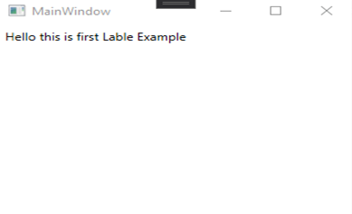
[Labels Example]
Buttons
No GUI framework will be complete without button control, it is very flexible and will allow you to complete almost anything, buttons are used for making event perform,buutons used for creating a clicked event in our project when we create any design like login etc. Let’s start with some basic examples
Example of Buttons: – here we can see the example of buttons, how buttons were created in our project and why we used buttons, so let’s see the example.
<Window x:Class=”blogpractice.MainWindow”
Xmlns =”http://schemas.microsoft.com/winfx/2006/xaml/presentation”
xmlns:x =”http://schemas.microsoft.com/winfx/2006/xaml”
xmlns:d =”http://schemas.microsoft.com/expression/blend/2008″
xmlns:mc =”http://schemas.openxmlformats.org/markup-compatibility/2006″
xmlns:local =”clr-namespace:blogpractice”
mc:Ignorable =”d”
Title=”MainWindow” Height =”450″ Width =”800″>
<Grid>
<Button Width =”100″ Height =”30″ VerticalAlignment=”Center” HorizontalAlignment=”Center”>Hello World</Button>
</Grid>
</Window>
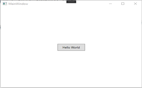
[Buttons Examples]
Editors
WPF Data Editors Library provides a set of editors and simple controls that can be used in WPF applications. Each editor provides the specific functionality required to edit certain types of data values.
- PasswordBox
- Textbox
- Rich Textbox
- InkCanvas
Textbox: – Textbox class enables you to display or edit unformatted text. A common use of the textbox is to edit unformatted text in the form. For example, a form asking for a username, phone number, etc. will use textbox controls for text input.
Example of Editors: – here we can see the example of Editors, how Editors were created in our project and why we used Editors, so let’s see the example.
<Window x:Class =”blogpractice.MainWindow”
Xmlns =”http://schemas.microsoft.com/winfx/2006/xaml/presentation”
xmlns:x =”http://schemas.microsoft.com/winfx/2006/xaml”
xmlns:d =”http://schemas.microsoft.com/expression/blend/2008″
xmlns:mc =”http://schemas.openxmlformats.org/markup-compatibility/2006″
xmlns:local =”clr-namespace:blogpractice”
mc:Ignorable =”d”
Title=”MainWindow” Height =”450″ Width =”800″>
<Grid>
<Grid.ColumnDefinitions>
<ColumnDefinition/>
<ColumnDefinition/>
<ColumnDefinition/>
<ColumnDefinition/>
</Grid.ColumnDefinitions>
<PasswordBox Grid.Column =”0″ Width =’200′ Height =”30″>
</PasswordBox>
<TextBox Grid.Column =”1″ Width =’200′ Height =”30″ Text =”Textbox”></TextBox>
<RichTextBox Grid.Column =”2″ Width =’200′ Height =”30″>
</RichTextBox>
<InkCanvas Grid.Column=”3″ Width=’200′ Height=”30″>
<Label>
in canvas
</Label>
</InkCanvas>
</Grid>
</Window>
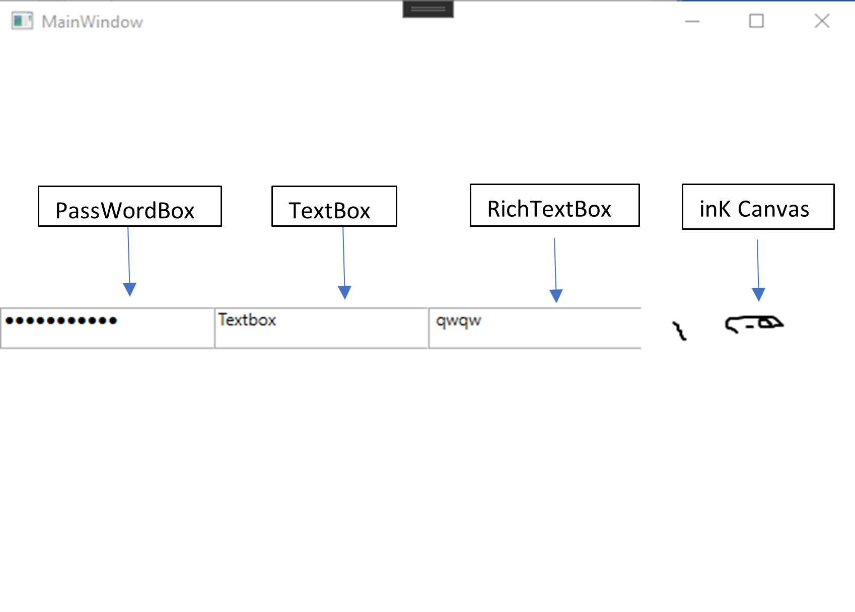
[Editors Example]
List
In wpf we use various forms of list to fill various requirements. In wpf have different list controls that used to set data in list format. List set data in proper way and we also use tree structure to set sub type list. Here are some list controls.
Four standard list controls – Listbox, Combobox, Listview, Tree View.
List controls can be filled out form one of the two sources.
- Items Property
- ItemsSource Property.
Example:
String [] items = new string[] {“a”, “b”};
ListBox list = new ListBox();
List.ItemSource = items;
ListBox list = new ListBox();
List.items.Add(“a”);
List.items.Add(“b”);
List View
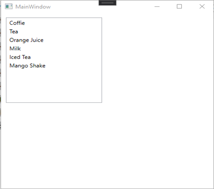
The ListView element in XAML represents the WPF ListView control. The name attribute represents the name of the control, which is the unique identifier of the control. The margin property indicates the location of the listview on parental control. Horizontal alignment and vertical alignment properties are used to set the horizontal and vertical alignment.
It has the ability to distinguish visual properties from control properties.
Example of ListView
<Window x:Class=”blogpractice.MainWindow”
xmlns=”http://schemas.microsoft.com/winfx/2006/xaml/presentation”
xmlns:x=”http://schemas.microsoft.com/winfx/2006/xaml”
xmlns:d=”http://schemas.microsoft.com/expression/blend/2008″
xmlns:mc=”http://schemas.openxmlformats.org/markup-compatibility/2006″
xmlns:local=”clr-namespace:blogpractice”
mc:Ignorable=”d”
Title=”MainWindow” Height=”450″ Width=”800″>
<Grid>
<ListView Margin=”10,10,0,13″ Name=”ListView1″ HorizontalAlignment=”Left” VerticalAlignment=”Top” Width=”194″ Height=”200″>
<ListViewItem Content=”Coffie”></ListViewItem>
<ListViewItem Content=”Tea”></ListViewItem>
<ListViewItem Content=”Orange Juice”></ListViewItem>
<ListViewItem Content=”Milk”></ListViewItem>
<ListViewItem Content=”Iced Tea”></ListViewItem>
<ListViewItem Content=”Mango Shake”></ListViewItem>
</ListView>
</Grid>
</Window>
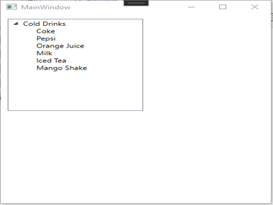
Tree view
The tree view presents data in a hierarchical view in the parent-child relationship where the parent node can be expanded or compressed. The left sidebar of Windows Explorer is an example of a Treeview.
Example of TreeView
<Window x:Class=”blogpractice.MainWindow”
xmlns=”http://schemas.microsoft.com/winfx/2006/xaml/presentation”
xmlns:x=”http://schemas.microsoft.com/winfx/2006/xaml”
xmlns:d=”http://schemas.microsoft.com/expression/blend/2008″
xmlns:mc=”http://schemas.openxmlformats.org/markup-compatibility/2006″
xmlns:local=”clr-namespace:blogpractice”
mc:Ignorable=”d”
Title=”MainWindow” Height=”450″ Width=”800″>
<Grid>
<TreeView Margin=”10,10,0,13″ Name=”TreeView1″ HorizontalAlignment=”Left” VerticalAlignment=”Top” Width=”194″ Height=”200″>
<TreeViewItem Header=”Cold Drinks”>
<TreeViewItem Header=”Coke”></TreeViewItem>
<TreeViewItem Header=”Pepsi”></TreeViewItem>
<TreeViewItem Header=”Orange Juice”></TreeViewItem>
<TreeViewItem Header=”Milk”></TreeViewItem>
<TreeViewItem Header=”Iced Tea”></TreeViewItem>
<TreeViewItem Header=”Mango Shake”></TreeViewItem>
</TreeViewItem>
</TreeView>
</Grid>
</Window>
Menus and Toolbars
WPF Menus comes with fine controls for creating menus. Adding items to it is very easy – you can just add Menu Item elements to it, and each Menu Item can have a range of sub-items, allowing you to create hierarchical menus as you recognize them from many Windows applications. Let’s go straight to the example where we use the menu:
Example of Menus & Toolbars
<Window x:Class=”blogpractice.MainWindow”
xmlns=”http://schemas.microsoft.com/winfx/2006/xaml/presentation”
xmlns:x=”http://schemas.microsoft.com/winfx/2006/xaml”
xmlns:d=”http://schemas.microsoft.com/expression/blend/2008″
xmlns:mc=”http://schemas.openxmlformats.org/markup-compatibility/2006″
xmlns:local=”clr-namespace:blogpractice”
mc:Ignorable=”d”
Title=”MainWindow” Height=”450″ Width=”800″>
<StackPanel Grid.ColumnSpan=”2″>
<Menu DockPanel.Dock=”Top”>
<MenuItem Header=”_File”>
<MenuItem Header=”_New” />
<MenuItem Header=”_Open” />
<MenuItem Header=”_Save” />
<Separator />
<MenuItem Header=”_Exit” />
</MenuItem>
</Menu>
</StackPanel>
</Window>
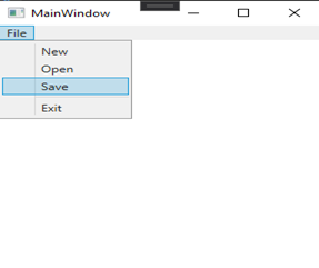
[Menu Bar Example]
Toolbar
Toolbar control is a group of button controls that can be used to achieve clicked functionality, for example, the toolbar in Microsoft Word and Visual Studio where you see the File Open, Save and Print buttons.
Example
<Window x:Class=”blogpractice.MainWindow”
xmlns=”http://schemas.microsoft.com/winfx/2006/xaml/presentation”
xmlns:x=”http://schemas.microsoft.com/winfx/2006/xaml”
xmlns:d=”http://schemas.microsoft.com/expression/blend/2008″
xmlns:mc=”http://schemas.openxmlformats.org/markup-compatibility/2006″
xmlns:local=”clr-namespace:blogpractice”
mc:Ignorable=”d”
Title=”MainWindow” Height=”450″ Width=”800″>
<ToolBarTray Background=”DarkGray” Height=”30″ VerticalAlignment=”Top”>
<ToolBar Name=”MyToolbar” Width=”200″ Height=”30″>
<Button Background=”LightSkyBlue” Content=”Open” />
<Button Background=”LightSkyBlue” Content=”Close” />
<Button Background=”LightSkyBlue” Content=”Exit” />
</ToolBar>
</ToolBarTray>
</Window>
[Toolbar Example]
ScrollViewer
The scroll viewer control consists of horizontal and vertical scrollbar elements and a content container (such as a panel element) to display other visible elements in a scrollable area.
Example of ScrollViewer
<Window x:Class=”blogpractice.MainWindow”
xmlns=”http://schemas.microsoft.com/winfx/2006/xaml/presentation”
xmlns:x=”http://schemas.microsoft.com/winfx/2006/xaml”
xmlns:d=”http://schemas.microsoft.com/expression/blend/2008″
xmlns:mc=”http://schemas.openxmlformats.org/markup-compatibility/2006″
xmlns:local=”clr-namespace:blogpractice”
mc:Ignorable=”d”
Title=”MainWindow” Height=”450″ Width=”800″>
<Grid>
<StackPanel>
<ScrollViewer Height = “200” Width = “200”
HorizontalScrollBarVisibility = “Auto” VerticalScrollBarVisibility = “Auto”>
<TextBlock Width = “300” TextWrapping = “Wrap”
Text = ” This license governs use of code marked as sample or example available
on this web site without a license agreement, as provided under the section above
titled NOTICE SPECIFIC TO SOFTWARE AVAILABLE ON THIS WEB SITE. If you use such
code (the software), you accept this license. If you do not accept the license,
do not use the software.Lorem ipsum dolor sit amet, consectetur adipescent elite.
Sed ac mi ipsum. Phaseolus vel malassada mauri’s. Donec pharetra, enemy sit amet
Mattis incidents, Felis nisi semper lectus, vel porta diam nisi in augur.
Pelletize laces torpor, aliquot et Fauci bus id, rhonchus Ut Justo. Sed id
lectus Odio, Eget pulvinar diam. Suspenders eleifend ornate libero, in locus
puros aliquots non. Sed integrum, Sem vitae rut rum rhonchus, Felis ligula ultrices
Sem, in eleifend eros ante id deque.” />
</ScrollViewer>
</StackPanel>
</Grid>
</Window>
[Example Of ScrollViewer]
Building Blocks
(1) ToolTip
The WPF tooltip control displays some information or hints about the control in the floating box when the mouse moves over that control and disappears when the mouse is moved away from that control. You can use the tooltip XAML element at design time to create and attach a tooltip to the control or use the tooltip C # object at runtime.
Example of ToolTip
<Window x:Class=”blogpractice.MainWindow”
xmlns=”http://schemas.microsoft.com/winfx/2006/xaml/presentation”
xmlns:x=”http://schemas.microsoft.com/winfx/2006/xaml”
xmlns:d=”http://schemas.microsoft.com/expression/blend/2008″
xmlns:mc=”http://schemas.openxmlformats.org/markup-compatibility/2006″
xmlns:local=”clr-namespace:blogpractice”
mc:Ignorable=”d”
Title=”MainWindow” Height=”450″ Width=”800″>
<Grid>
<Button Content=”Click Here” Margin=”30″ FontSize=”16″ Width=”200″ Height=”50″>
<Button.ToolTip>
<ToolTip>
Click Here
</ToolTip>
</Button.ToolTip>
</Button>
</Grid>
</Window>
[Example Of ToolTip]
(2) Thumb
Thumb class which is another base class of WPF layout control and visual control. It defines the methods, properties, and events for controls that can be dragged by the user using a mouse or a similar pointing device. Dragging is usually done to resize or move the controls. The thumb is also used in other WPF controls such as the scrollbar.
Example of Thumb
<Window x:Class=”blogpractice.MainWindow”
xmlns=”http://schemas.microsoft.com/winfx/2006/xaml/presentation”
xmlns:x=”http://schemas.microsoft.com/winfx/2006/xaml”
xmlns:d=”http://schemas.microsoft.com/expression/blend/2008″
xmlns:mc=”http://schemas.openxmlformats.org/markup-compatibility/2006″
xmlns:local=”clr-namespace:blogpractice”
mc:Ignorable=”d”
Title=”MainWindow” Height=”450″ Width=”800″>
<Grid>
<Grid.ColumnDefinitions>
<ColumnDefinition Width=”1*”/>
<ColumnDefinition Width=”2*”/>
</Grid.ColumnDefinitions>
<TextBlock Name=”LeftText”/>
<TextBlock Name=”RightText” Grid.Column=”1″/>
<GridSplitter Name=”MyGridSplitter”
Background=”Gray”
Width=”5″
HorizontalAlignment=”Right”
VerticalAlignment=”Stretch”></GridSplitter>
</Grid>
</Window>
[Example of Thumb]
(3) Border
Borders work a little differently in WPF. Borders in XAML have their own controls that can be applied to other controls or XAML elements. To place a border around an element, WPF provides a border element. Like other WPF elements, borders have width, height, background and horizontal alignment, and vertical alignment properties.
In addition to these common properties, the border has two properties that make the border. These two properties are Border Thickness and Borderbrush. The Borderbrush property represents a brush used to draw a border. Border thickness property shows the thickness of the border
Example of Border
<Grid>
<Border
BorderThickness=”5″
BorderBrush=”Green”
CornerRadius=”10″
Background=”LightGray”
HorizontalAlignment=”Left”
VerticalAlignment=”Top”
Width=”270″
Height=”250″ />
</Grid>
[Example of Border]
(4) Popup
A popup in WPF is a window floating on a page or window that provides functionality for some quick action, Width and height properties show the width and height of the popup. The name attribute represents the name of the control which is the unique identifier of the controls. The margin property is used to set the location of the popup on Parental Controls. Horizontal alignment and vertical alignment properties are used to set the horizontal and verticalalign.
Example of Popup
<StackPanel>
<CheckBox Name=”PCheckBox” Margin=”10,10,0,0″ Content=”Popup Window” />
<Button HorizontalAlignment=”Left” Width=”129″ Margin=”10,10,0,0″>
<Button.Triggers>
<EventTrigger RoutedEvent=”Button.Click”>
<BeginStoryboard>
<Storyboard>
<DoubleAnimation Storyboard.TargetName=”theTransform” Storyboard.TargetProperty=”(RotateTransform.Angle)” From=”0″ To=”360″ Duration=”0:0:5″ AutoReverse=”True” />
</Storyboard>
</BeginStoryboard>
</EventTrigger>
</Button.Triggers> Start Animation
</Button>
<Popup IsOpen=”{Binding ElementName=PCheckBox,Path=IsChecked}” PlacementTarget=”{Binding ElementName=PCheckBox}” AllowsTransparency=”True” PopupAnimation=”Slide” HorizontalOffset=”150″ VerticalOffset=”100″>
<Canvas Width=”100″ Height=”100″ Background=”Red” Margin=”150″>
<Canvas.RenderTransform>
<RotateTransform x:Name=”theTransform” />
</Canvas.RenderTransform>
<TextBlock TextWrapping=”Wrap” Foreground=”LightGray”> Rotating Popup</TextBlock>
</Canvas>
</Popup>
</StackPanel>
(5) Document Viewers
DocumentViewer provides a very easy way to display the contents of a document, DocumentViewer Edit the formfield of the Template, and navigate around the document in a web browser. The server component returns standard web file formats (HTML, CSS, JS, and JPG, etc.), so the documents can be displayed in the browser without installing any third-party plugins or extensions.
WPF does not support the functionality for viewing Microsoft Word documents but there is a function to fix this problem. The WPF DocumentViewer control is used to display fixed documents such as the XPS (XML Paper Specification) document. If we can convert a Word document to an XPS document, we can open a Word document. This conversion is possible using the Office Interop and Office Tools framework used to work with Office documents.
(6) Frame
In WPF we can use the frame control to display the contents of another window with the same window.
We can navigate to another form and display the contents of that form in the same window. Frame control in WPF supports navigation within the content. It can be hosted in an A-frame window, navigation window or user control, etc. The element in XAML is used to create frame controls.
(7) Ranges
Range control provides support for selecting a range of values using two thumbs. When the ShowRange property is set to True, two toes are placed on the track. One thumb is used to update the beginning of the series selection and the other thumb is used to update the end of the series selection.
For more information, you have to visit here.
(8) Containers
A container class is a class used to store items in memory or external storage. The container class acts as the general holder. The container class has a predefined behavior and a well-known interface
Conclusion
In conclusion, this blog has covered the various controls of WPF and its code example which will hopefully help you to understand how it works. WPF is also known for security because it is a platform developed by Microsoft to keep a keen eye on cyber risk trends to look out for safe business. Although there is much more to cover about these controls in-depth that shall cover in a different blog. It is an essential topic to understand Design in WPF.
Also Read: The Ultimate Guide to the New York Mets: Insights, Trivia and More!